Designing your business card is the core task for
making your business card. This page goes through
the design process and shows how to use desktop
publishing software. The goal of this page is to
have a design that is ready to be packaged for
production. The previous page of our guide is about
the
manufacturing options
for your business card.
Graphic Design Work Process
To help you get into the mindset of graphic design
work we would like to take a few moments to talk
about the graphic design work process. Design work
needs a different type of work process than the
majority of everyday tasks. The majority of everyday
tasks can be accomplished by following a linear/sequencial
process. These processes consist of a fixed
sequence, with fixed steps to produce a predetermined
result. In contrast, design work is accomplished with
an iterative/cyclical work process. These processes
consist of a set of steps that are repeated
over and over, and which produce a different result
every time.
What does the set of steps for the design work process
consist of? We define the following steps for one cycle within the design
work process: "generate ideas", "persue ideas",
"assess results" and "decide on results".
Generating ideas means: To try to find answers to the
question about "what can you do to achieve a pleasing
result"? For example, where to place an item and how
to form its appearance, what styles to apply? Tip:
The more ideas you generate the higher the chances of
generating a great idea. Tip: To minimize the work of
a new idea, try to evaluate it before you persue it.
Persuing an idea means: To act on it, doing practical
work, applying the opportunities of the craft and your
tools.
Assessing results means: To assess/evaltuate the
change of your design compared to the previous state.
For example, you would look at your creation and ask yourself,
what you think of this new state. Tip: Don't assess to
early/too often because you could fall into a
microoptimization trap. Tip: Assess with final output
in mind: if your final workpiece is printed, then don't
just evaluate its appearance on screen.
Deciding on results means: To decide on how to act on
your result assessment. You have three basic options:
"keep the result and move on", "refine the result by
doing another work cycle" and "discard the result and
start over".
Why would you choose one over another? Decide on
keeping the result if you like it and don't think
you can make a noteable improvement with reasonable
effort. In practice you could experience that a
result is not better compared to the previous state.
Decide on refining your result if you think you can
make a notable and required improvement
with reasonable effort. Don't do more work than
required. Don't fall into the perfection trap.
Decide on discarding your result if you don't like
it and don't think you can change that with reasonable
effort.
Design Principles
Design Principles help you make a composition aesthetically
pleasing.
1, Emphasis [Focal Point; Message]
2, Hierarchy [Visual Roadmap]
3, Alignment and Grid
4, Proximity and Grouping
5, Contrast
6, Proportion
7, Balance [elements; visual weight]
8, Repetition
9, White Space [doesn't have to be white...]
10, Movement
11, Rythm
12, Unity vs. Variety
13, Pattern
14, Color Harmony
15, Depth
Main Section
From the introduction, we now move on to the main
section of this page. We are going to use the
desktop publishing software
Scribus
1.6.4 [stable release] for this project. If you haven't
installed Scribus yet, then now is the time to do
so.
Scribus Applicaton Preferences
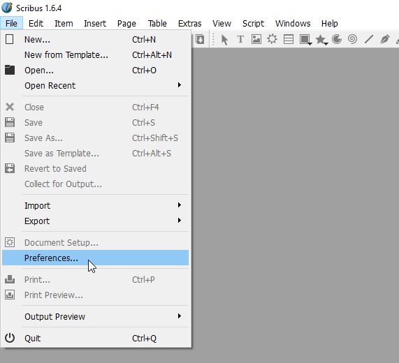
After you have launched Scribus, we first want to
look at some important application preferences. To
open the preferences window we click "File" and then
"Preferences..." in the menu bar.
There are preferences that are only available at the
application level, while other preferences are simply
default values that can be overwritten at the
document level. The first two preferences we look
at are only available at the application level.
The user interface elements of Scribus are rather
small. Likely in order to maximize the visible
document area. If you have a hard time reading the
menu lables, you can increase their font size in
the "User Interface" preferences window.
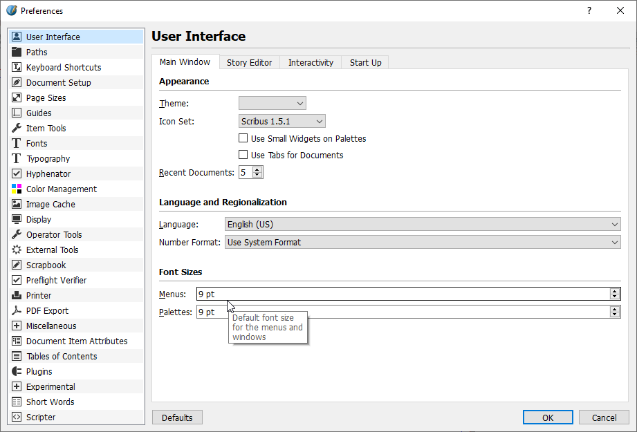
The second preferences window we look at is the
"Paths" window. In particular, we are interested in
the "Color Profiles" path. This is the file
structure path to a folder where you can store icc
color profiles that you want to use in a Scribus
project but which you don't want to install on your
system.
We need icc profiles to convert RGB screen colors
to CMYK print colors as accurately as possible.
For example, we use the "GRACoL 2006 Coated"
profile as our standard CMYK profile. You can
download the
"GRACoL2006_Coated1v2.icc"
file from the International Color Consortium's website.
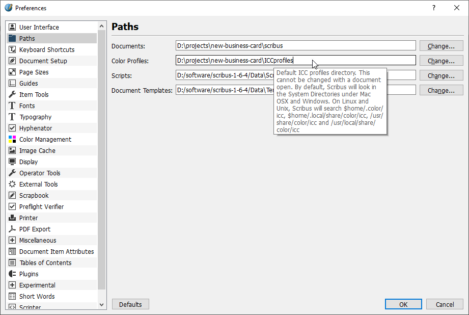
Next comes the "Fonts" preferences window. There
you can select the "Additional Paths" tab, where
you can "Add..." a file structure path to font file
directories. Just like with icc color profiles, you
only need to enter the path of directories with
fonts you don't want to install on your system.
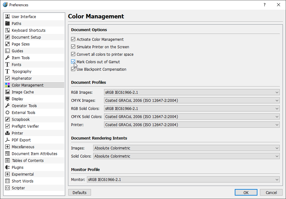
"Color Management" is another impotant preferences
window. In the screenshot below you can see how we
configured it for us. We turn on all options in the
"Document Options" section. There is one option that
is called "Mark Colors out of Gamut". When this
option is turned on, out of gamut colors are
displayed as bright green pixels.
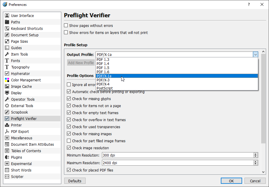
Now we are going to look at two preference windows
regarding the PDF file generation. We start with the
"Preflight Verifier" preferences window. There we
want to select our standard print PDF file format
from the "Output Profile" drop down. We also set the
"Minimum Resolution" to 300 dpi. What does preflight
mean? One definition could be: To perform a series
of tests to verify the readyness to generate a
standard compliant PDF file from our Scribus
document.
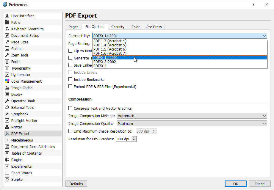
Finally we move on to the "PDF Export" preferences.
We select the "File Options" tab and also select
the "PDF/X-1a:2001" PDF file standard from the
"Compatability" drop down.
Great! You can now click on "OK" at the bottom
right of the preferences window to confirm all
changes and to close the window.
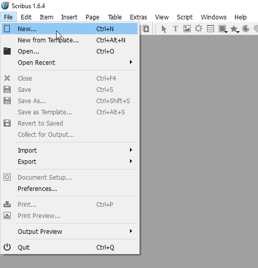
New Scribus Document
Now that we have finished setting application
preferences, we can create the document for our
business card. For this we click "File" and then
"New..." in the menu bar.
This opens the "New Document" window in which we
can set the attributes for our business card
document. The "Width" and the "Height" values
represent the final size of the business card. We
want a standard size business card, therefore we
enter the values 3.5" x 2.0". For the margins and
bleeds we enter standard industry values of 0.125"
for now. We can adapt these later on, before we
generate PDF files for a specific printing service.
We set the number of pages to two, so that we can
work on the frontside and backside in one document.
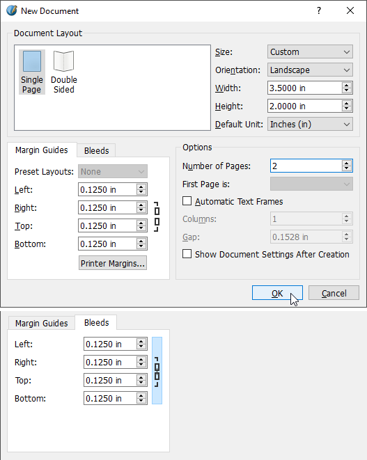
Once you confirmed your settings by clicking on
the "OK" button, Scribus displays the new document.
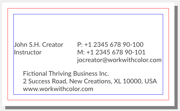
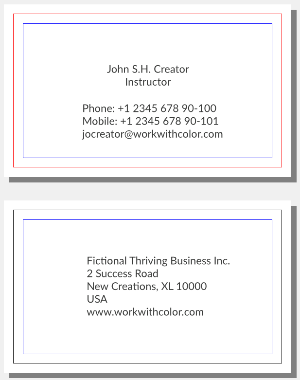
The blue line confines the safe area, the red line
represents your document dimensions.
What is the safe area? It's the area a printing
service guarantees no content will be cut off
during the cutting process. The cutting accuracy
is a major quality feature of a printing service.
The cutting may be accurate but it's not guaranteed.
Cutting lines could be displaced or askew.
What is the bleed area? In the screenshot it's the
area outside of the red line. If you have artwork
that goes all the way to the edge, then you should
expand your artwork to also cover the bleed area.
This is supposed to compensate for any cutting
inaccuracies.
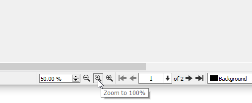
To center and zoom our document we use the
relevant buttons in the status bar.
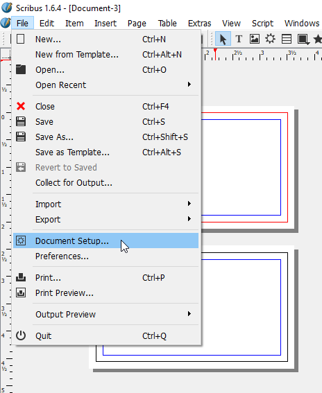
Just a quick side note about preferences at the
document level: From the project perspective
there is no need to change any preferences at the
document level. We are good with the changes we have
made at the application level. In case you want
to change any preferences at the document level,
you can do this by clicking on "File" and then
"Document Setup..." in the menu bar.
We conclude the step of creating the new document
with saving the document with a new file name.
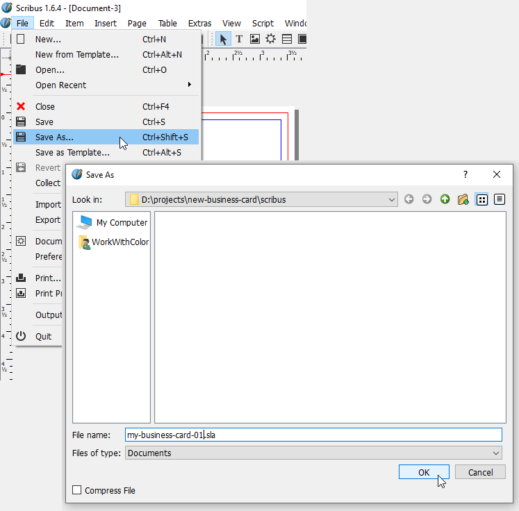
Create Color Data Objects
When you work with graphics software, color in
general is only an attribute you assign to shapes
and text. But when you work with desktop publishing
software, you have to create data objects for all
colors you want to use in your document. This way
more information than simple color values can be
stored, which can be impoprtant for printing.
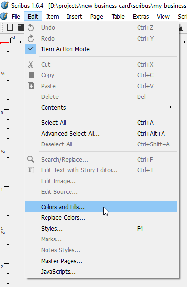
We usually seek to add colors as the first step
after having created a new document. For this we
click "Edit" and then "Colors and Fills..." in
the menu bar.
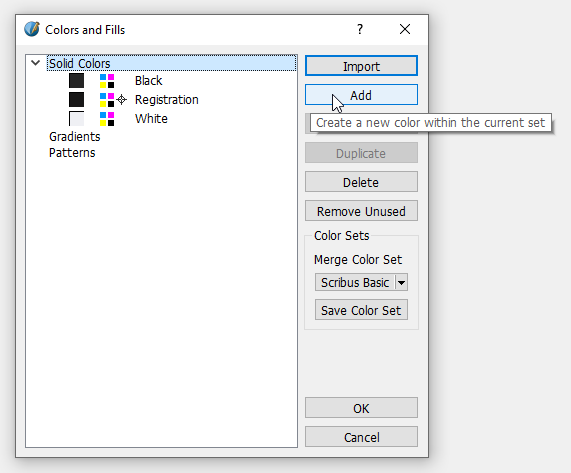
When the "Colors and Fills" window opens you can
see an example color set. You can remove the colors
of the example set by clicking on the button
"Remove Unused".
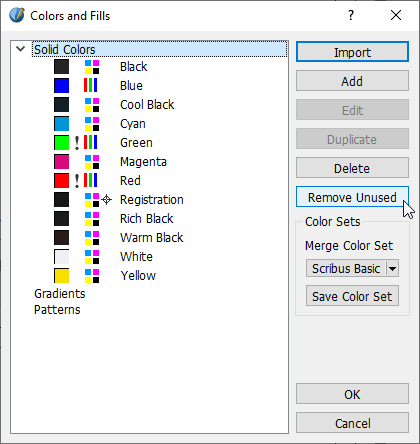
Three colors can't be deleted. Before you can add
a new color you might have to activate
"Solid Colors" again.
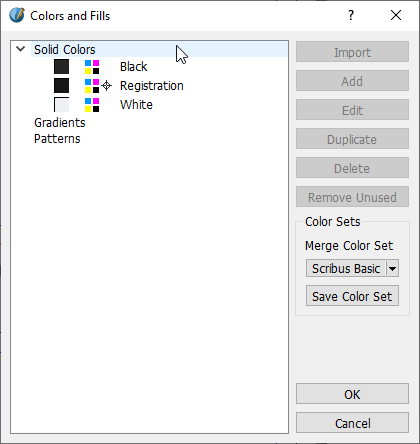
Then you can click the "Add" button to add a new
color data object.
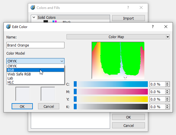
This opens the "Edit Color" window. Here you can
see several input fields to define a new color.
Notice how out of gamut colors are displayed as
bright green pixels in the color map and in the
color model bars. We want to begin with adding our
brand orange color. Our brand orange is defined as
an sRGB color with the values R:240, G:139 and
B:39. To enter these values we have to select the
"RGB" option from the "Color Model" drop down.
The color fields indicate that our sRGB color is
in gamut of our target color space (GRACoL).
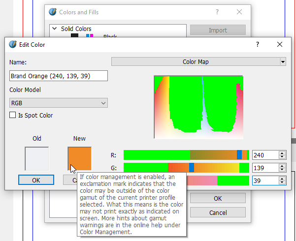
We could convert our RGB color into CMYK color
right away. This would calculate the CMYK values
of our brand orange for the "GRACoL 2006 Coated"
color space.
But we stay more flexible if we convert colors as
one of the last steps before generating PDF files.
Therefore we leave it as RGB color for now and
click "OK" to add the color to the list. We
repeat this process for all colors we want to
add and after that our "Colors and Fills" window
looks like this:
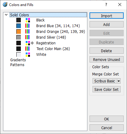
We click on "OK" again to conclude the step of
adding colors to our document.
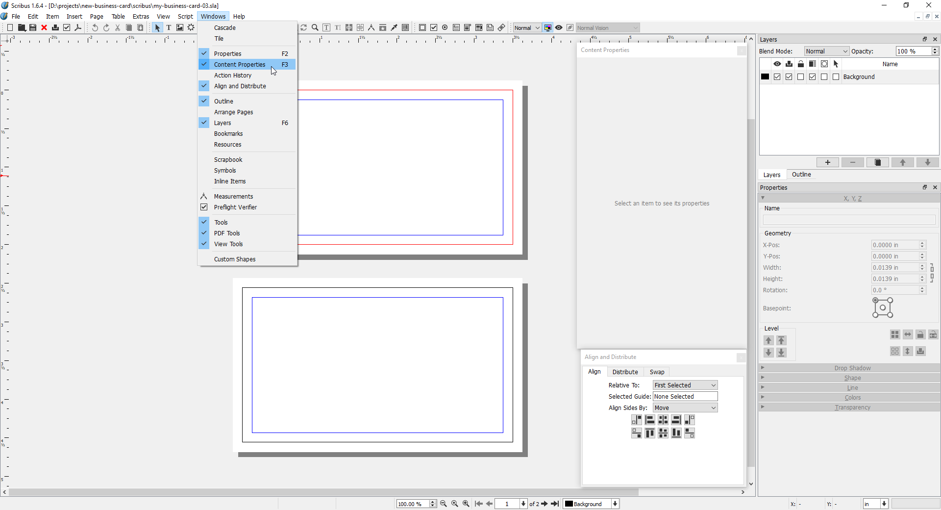
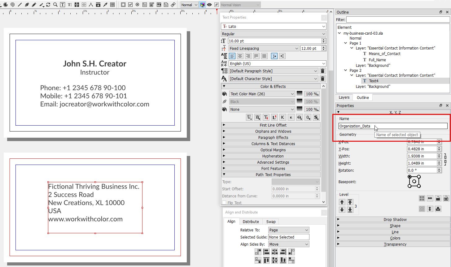
Insert Essential Contact Information Content
Before we start adding content to our document we'd
like to show you how we arranged the necessary panel
menu windows. You can add panel menu windows by
clicking on "Windows" and then on the desired
window label in the menu bar.
All right, let's start adding content. We want to
do this in the same order as we discussed it on our
page
"Prepare Business Card Content".
So we start with essential contact information content.
We split this content into three groups: 1, full
name and job title; 2, means of contact;
3, organization data;
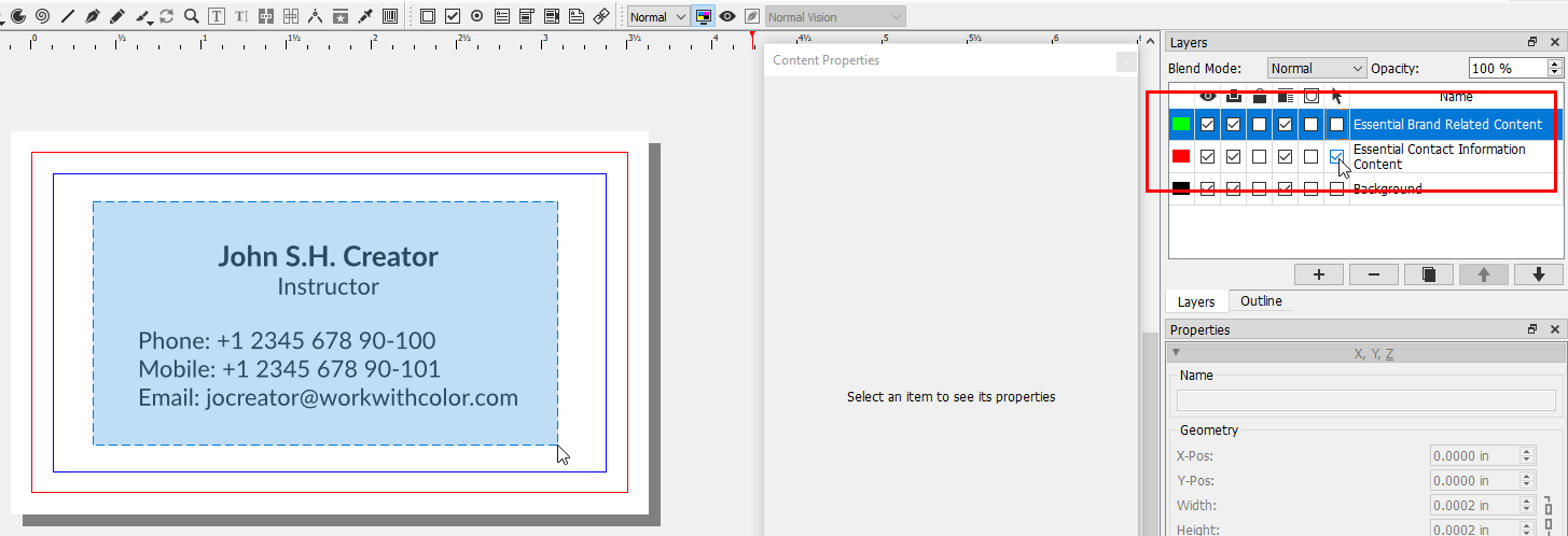
We want to put this content in its own layer and
so we add a new layer by clicking on the "+"
button in the "Layers" panel.
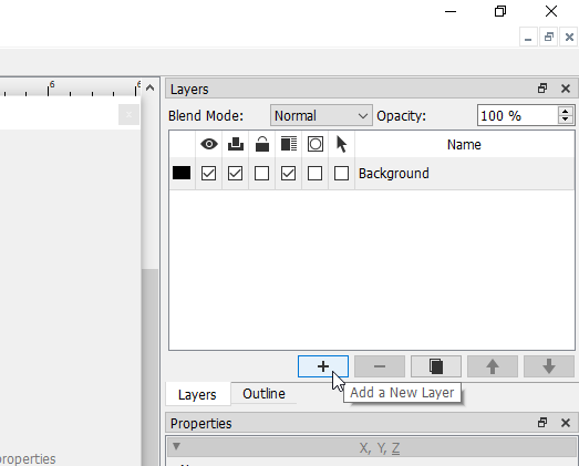
While we are at it, we rename "New Layer 1" into
"Essential Contact Information Content" by first
double-clicking on the name field.
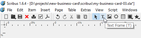
To add the first text group, we first click on
the "Text Frame (T)" tool button in the tool bar
to activate it.
The mouse cursor now indicates the selected tool.
Then we create a text frame on the canvas by
holding down the left mouse button and draging
the mouse to the right and the bottom.
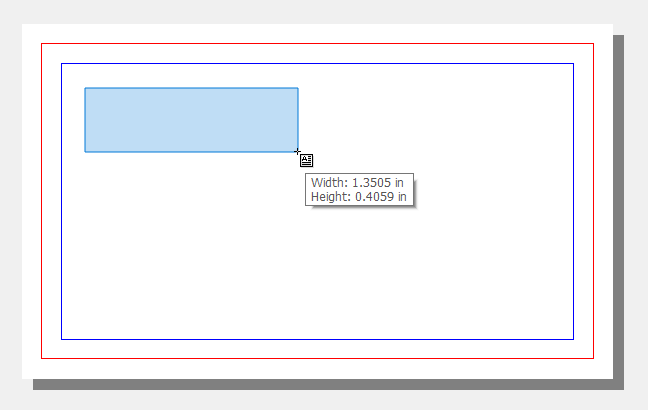
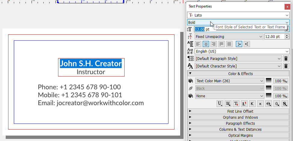
After we release the mouse button the text frame
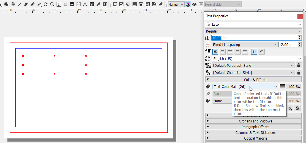
is outlined in red. Furthermore, the "Text
Properties" panel is now activated. We edited
several attributes there: We changed the font
family to "Lato", the font size to "10.00 pt",
the line spacing to "12.00 pt" and the text
color to "Text Color Main (26)".
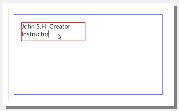
Note that text properties can be set for a text
frame and text elements inside a text frame
separately. We can write the full name and job
title into the text frame by first double-clicking
on it.
Text properties settings are not preserved for
the next text frame. You always start with the
settings of the default style. For bigger
projects you could edit the default style or
create new styles. In our case, we just copy
and paste the first text frame if we want to
create a new one.
So next we create the text frames for the means
of contact group and organization data group.
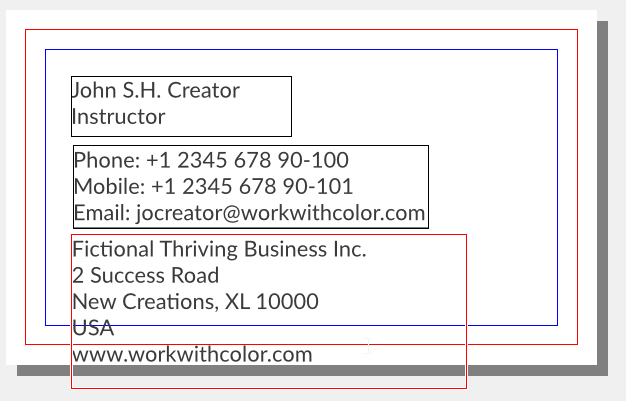
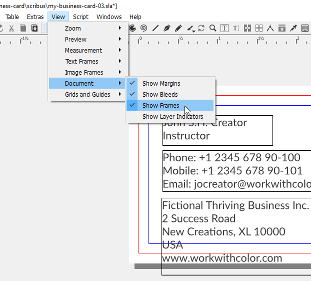
The outlines of the text frames seem distracting.
We can turn this feature off by clicking on
"View" and then "Document" and then "Show Frames"
in the menu bar.
Now we can experiment with positioning the texts.
There are four options for positioning elements
in Scribus: With your mouse, with your keyboard's
arrow keys, with the input fields in the [object]
"Properties" panel menu and with the features of
the "Align and Distribute" panel menu. For text
in particular, there is the additional option to
use the alignment features in the text properties
panel menu.
Here are a few suggestions on how you could
arrange the three text groups.
1, One column [1, 2, 3]
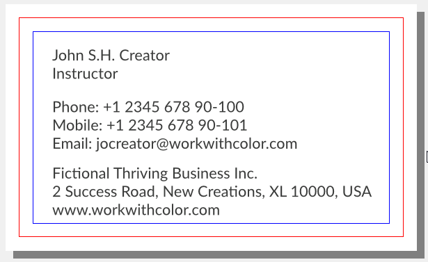
2, One column [1, 3, 2]
3, Two columns [1 + 2, 3]
4, Two columns [1, 2 + 3]
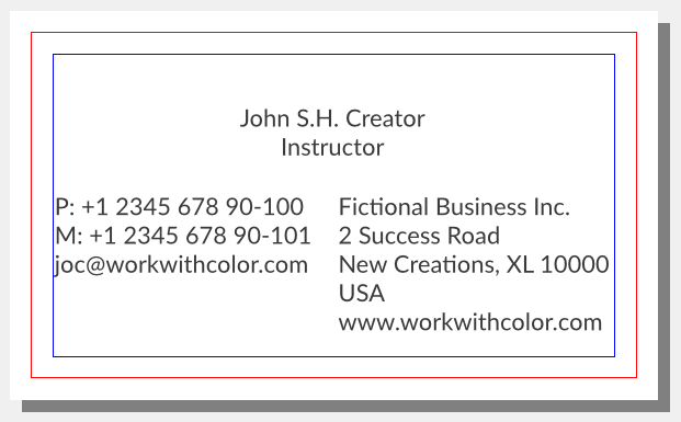
5, Frontside [1, 2], backside [3]
We decided to go with option five. This means text
block three will share the available space with
optional content.
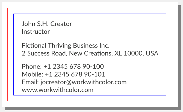
Next we changed the appearance of the first text
frame. We set "Align Text Center" for the whole
text frame and changed font style and font size
only for the first line.
Further text adjustments are applied later on with
regard to other elements. To conclude this
section we rename our text frame elements to
better recognize them in the outline window.
Insert Essential Brand Related Content
After we added essential contact information content,
we want to add essential brand related content. This
consists of our logo and our tagline. Our logo is
made of vector graphics which we created with
Inkscape.
This means we are going to import
a vector graphics image into Scribus.
Before we import image files into Scribus we try to
prepare them in their respective graphics application
as well as possible. Our goal is that positioning
will be the only operation we have to perform in
Scribus with these images. This means we try to
solve any quality or size issues before we import
them. This may not always be possible or practical.
We performed some operations in Inkscape to prepare
our logo for import. These might all not be necessary
but if you encounter any problems you will have
starting points to solve them.
Furthermore, we decided early on that we want to
frequently show our logo and tagline together and
therefore prepared a logo-tagline image for
convenience.
We begin importing the image file with creating a
new layer and naming it "Essential Brand Related
Content". Then we want to move text groups one and
two to make some space for the image. But if you
want to select elements that are on a different
layer than the active one, you first need to turn
on the "Select Objects on Layer" feature in the
"Layers" panel menu.
After moving the text frames we click "File" and
then "Import" and then "Get Vector File..." which
opens the "Open" file dialog.
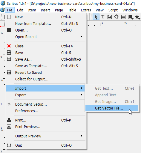
We select the file we want to import and click
on "OK". The mouse cursor now indicates the import
function status.
We move the mouse cursor roughly to the position
where we think the top left corner of the image
should be and place the image with a single click.
If your vector graphics image had any colors not
found in the current color palette, they would be
added to the set upon import.
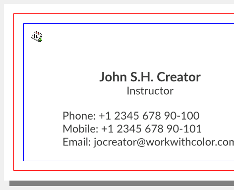
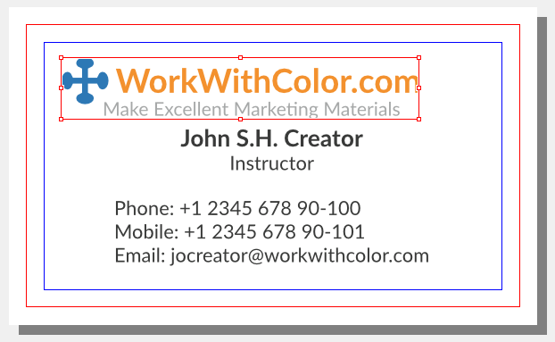
We have established a general rule that we want
to position our logo at the top center of workpieces.
Therefore, we move it there but we try to center it
by its visual weight. The blue element of the logo
is heavier than the orange element and so we move
it slightly to the right.
From time to time you may want to look at the
canvas without any outlines or guides. There is
a "Preview Mode" for this which you can turn
on by clicking on the respective button in the
tool bar.
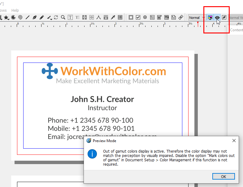
At the moment this displays a warning message.
If this message annoys you, turn off the "Mark
Colors out of Gamut" feature in the "Color
Management" preferences window of the document.
In preview mode the canvas currently looks as
follows:

If you wanted to change the size of your image
but preserve the width-to-height ratio, you can
hold the CTRL key while dragging a corner handle
of your image with your mouse.
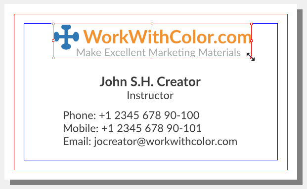
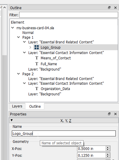
To conclude this section we rename our image
element which you can see in the "Outline" panel
menu.
Insert Optional Content
The next step is to add optional content if you
wanted to include any. We create a new layer and
name it "Optional Content".
What optional content did we think of? We
thought we could add value by providing a
mini-guide that is inspirational and fun. Here
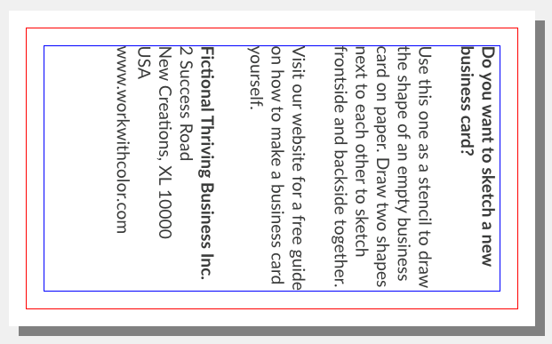
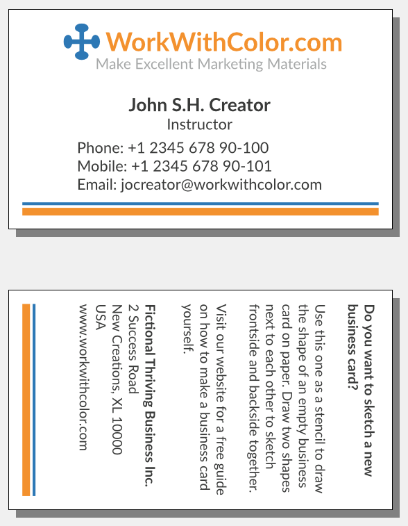
is the text of our mini-guide:
"Do you want to sketch a new business card?
Use this one as a stencil to draw the shape of
an empty business card on paper. Draw two shapes
next to each other to sketch frontside and
backside together.
Visit our website for a free guide on how to
make a business card yourself."
To add this text we copy and paste an existing
text frame, place it in the backside page and
enter the text.
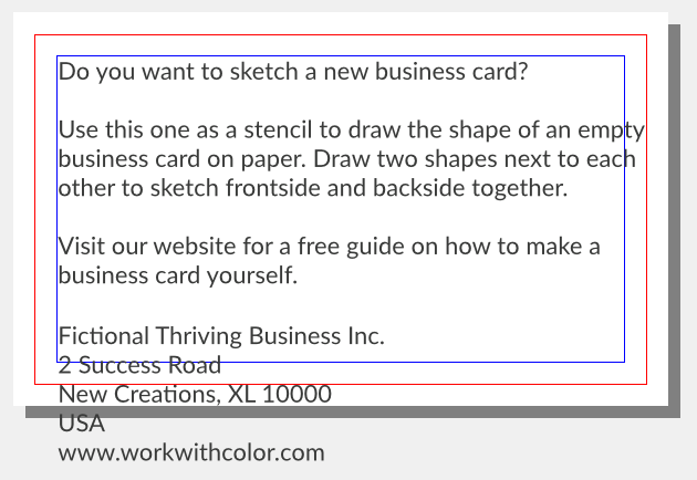
The text is too big for the available space, so
we start looking for ways to make it fit. First
we try to reduce the font size to 9.00 pt and
rearrange some text.
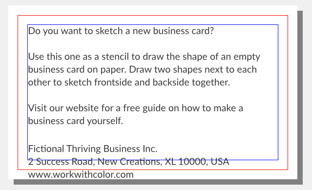
This is better but the content still doesn't fit.
One thing you can discover in the screenshot is
that there are three lines of text that barely
cover half of their line. This led to the idea
to check out what happens if we changed the
content's layout orientation from landscape
to portrait.
We can rotate elements with the "Rotation"
input field in the "Properties" panel menu.
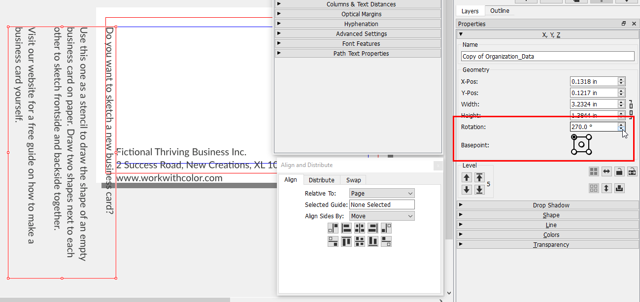
Then we resize and reposition the text frames.
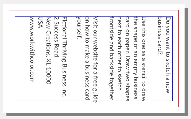
This looks promising but we do three more tweaks.
Reduce the font size to 8.80 pt, reduce line
spacing to 10.80 pt and change the font style to
bold for the heading and the company name.
To conclude this section, we rename the new text
frame and save the changes.
Add Complementary Graphics
At the moment the design has lots of text and only
little graphics. It seems boring. Something is missing.
To make the design more interesting we want to add more
graphics. We think of them as complementary graphics.
They complement the current composition [lots of text]
and the logo as the only graphic.
We want to work with rectangles [ ] because the most
popular marketing materials are rectangular. So we
sketched a few ideas but they all took up too much space.
Then we thought that bars are thin rectangles and that
repetition is our friend. So to complement the logo we
want to create two bars of different sizes with the
logo colors. We place these at the bottom of the pages
and center them because our logo is centered. If we
had put our logo on the left or right, the
complementary graphics would mainly cover the
opposite corner.
We start with adding a new layer and naming it
"Complementary Graphics". Then we activate the
"[Rectangle] Shape (S)" tool in the toolbar.
We draw a rectangle on the canvas and edit its
attributes in the "Properties" panel menu. We change
the name, x-pos, y-pos, width, height, fill color
and unset stroke color.
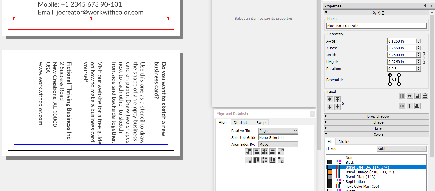
And then repeat it for the other rectangles.
NOTE that this type of design choice
is usually recommended against. If your business
card is cut slightly skewed, then these kind of
shapes make it even more visible. On the other hand
we have seen many perfectly cut business cards and
so we want to take the risk.
This time we gave elements a new name immediately.
So to conclude this section, we only have to save
the changes.
Finishing the Design
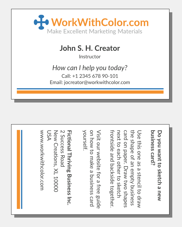
Now that we are about to finish our design, we would
like to explore the question of how we could increase
our chances that somebody actually contacts us. After
all, this is the main response we hope to get from
people to whom we give our business card. For this
purpose we want to include a message that resonates
with recipients as well as a call to action.
A positive and inviting message could simply be:
"How can I help you today?"
As for the call to action, we thought of renaming the
means of contact labels, e.g. from "Mobile" to "Call".
We want to present only two action options and so we
delete the "Phone: [...]" text line. This also frees
up much-needed space. Here is what the design looks
like now:

Now you can understand why we mentioned earlier that
we are not going to use icons instead of labels for our means
of contact.
We did a few more adjustments to finish our design:
This is our preliminary design:
Conclusion
Let's now summarize this page. In the introduction
we first discussed the cyclical nature of a design
process compared to the sequential nature of processes
for most everyday tasks.
Next we listed general graphic design principles to
guide your design work.
We started the main section with setting up our digital
design workspace. This included creating a new Scribus
document.
We then started adding content in the same order
as discussed on our page "Prepare Business Card
Content". We added essential contact information content,
essential brand related content and optional content.
Each time we positioned and adjusted the created
elements to gradually build up the design.
The next step was concerned with improving the
design aesthetics by adding complementary graphics.
In the final design phase we crafted a message and
a call to action to increase our chance of getting
the desired response from people to whom we give
our business card.
Finally, we looked for elements that didn't
seem right yet and applied final adjustments.
Before you can turn your design into print files,
you need to collect vendor specific technical requirements.
Therefore, your next step is to
choose a business card printing service [coming soon].