Colors of the Rainbow
Color Vision
Color Properties / Terminology
Color Luminance
The Color Wheel
Color Space and Gamut
Multi Model Color Blender
Color Converter
HSL Color Schemer
Colors by Name
1-2-3 Image Resizer
Black & White Picture Converter
Sepia Tone Picture Converter
Gray Card
Color Luminance
A certain color can be defined by hue (0° - 360°), saturation
(0% - 100%) and lightness (0% - 100%). Luminance on the other
hand is a measure to describe the perceived brightness of a
color (Encyclopædia Britannica: "luminance,
or visually perceived brightness"). You can lighten or darken a
color by adjusting its lightness value, but lightness is not the only
dimension to consider for luminance. That is because each hue
naturally has an individual luminance value.
In HSL color space pure hue is defined at a saturation level
of 100% and a lightness level of 50%. To visualize the individual
luminance of hue, let's have a look at the main hues of a color
wheel with constant saturation and lightness levels converted
to grayscale. This way three dimensions of a color are mapped
to one dimension, i.e. light(ness), with a reference to
white = 100%.
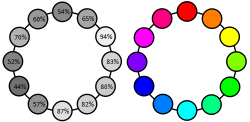
You can see that blue has the lowest and yellow has the highest
luminance value. Yellow is actually just six percentage steps
away from white. It's good advice to roughly remember the luminance
values of the main hues, as it helps to work more intuitively with
color.
If luminance is dependent on hue, it's also dependent on saturation.
Reducing the saturation level of any pure hue to 0% results in a
50%-gray and a 50% value in luminance respectively. So for hues
with natural luminance above 50%, luminance decreases when the
saturation level decreases. For hues with natural luminance below
50%, luminance increases when the saturation level decreases.
In conclusion, luminance is dependent on all three dimensions of
color. Now you also get a good idea of how color information is
handled in grayscale images.

Luminance improves your color choices
When you know luminance values, you also know the amount of contrast
between two colors. Contrast as in the distance of luminance between
two colors. For one color you always know the contrast value in
relation to any grayscale value.
Color decisions need to consider luminance / contrast because it is key
to usability. It's the most powerful visual information
What does that mean in practice? Test for contrast from how people
experience a composition. Starting from a single element, to other
elements, sectionwise, levelwise, finally to the overall
composition and then the other way round. Compositions in this
context can be everything from what you wear to a website, or product
packaging.
To test a composition for contrast, make a screenshot or take a
picture and convert it to grayscale (the Black and White Picture
Converter can handle .jpg and .png files).
When you are about to make color choices, tools like the HSL Color Picker let you monitor luminance
values to manage contrast from the beginning.